Key Factors When Choosing Kitchen Cabinet Colors
Discover the essential architectural, structural, and material factors that determine the selection of kitchen cabinets colors for large-scale projects.
The selection of cabinetry finishes in residential and commercial developments has evolved beyond simple aesthetic preferences. In modern property development, hospitality design, and multi-family housing projects, cabinet color selection represents a multi-faceted architectural decision that directly influences spatial perception, light reflection, surface durability, and long-term asset value.
For developers, architects, general contractors, and procurement professionals, specifying the appropriate surface finishes for kitchen cabinets requires balancing aesthetic vision with rigorous technical considerations. This comprehensive engineering report outlines the primary criteria governing professional cabinetry color selection, offering a structured framework for large-scale architectural and interior fit-out projects.
1. Spatial Proportions and Luminance Values
The physical volume of a kitchen and its exposure to natural and artificial light dictate the viable palette range for interior joinery. Color selection must account for the light reflectance value (LRV) of surface coatings, as well as the dimensional characteristics of the space.
Volumetric Perception and Color Weight
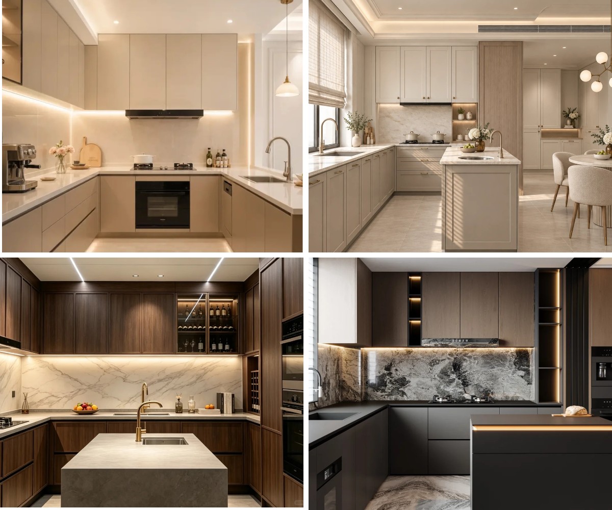
Light colors—such as soft whites, off-whites, and muted alabaster—possess higher LRV coefficients. They reflect ambient light throughout the room, creating an optical illusion of expanded space. In compact residential layouts, high-density apartment units, or kitchens with single-source natural lighting, lighter finishes mitigate visual congestion and enhance spatial openness.
Conversely, darker finishes—including deep anthracite, dark walnut, charcoal, and midnight blue—absorb light and add visual mass. When applied in expansive open-plan layouts, double-height architectural residences, or luxury penthouses, deep tones ground the space, establishing an atmosphere of refinement and structural permanence.
Orientation and Natural Daylight Calibration
The temperature of incoming daylight varies significantly according to architectural orientation:
North-Facing Elevations: Natural light in northern orientations tends to carry cool, blue undertones. Utilizing cool grays or stark whites in these environments can make a space feel clinical or cold. Warmer neutral tones, creamy off-whites, or soft honey wood veneers are strategically used to balance the cool ambient light.
South-Facing Elevations: Southern exposure provides abundant, warm sunlight throughout the day. In these settings, cooler greiges, slate tones, or matte dark finishes absorb excess glare and maintain color stability without appearing overly saturated.
2. Structural Materiality and Surface Finish Engineering
Color manifests differently depending on the underlying substrate, grain structure, and surface application method. Selecting a cabinet color requires selecting the correct material coating system to ensure color fidelity over decades of use.
Natural Wood Veneers vs. Synthetic Decorative Films
Engineered Wood Veneers: Natural oak, walnut, and ash veneers introduce organic grain variation. Color selection in veneered kitchen cabinets must account for subtle tonal shifts across log cuts. Clear lacquers and stain formulations accentuate natural pore structures, giving warm amber, smoked brown, or natural beige tones a distinct depth that synthetic films cannot replicate.
High-Pressure Laminates (HPL) & Melamine: For high-traffic commercial residences, engineered decorative laminates provide uniform color consistency across thousands of cabinet doors. Modern HPL manufacturing enables exact color matching across large project phases, eliminating batch-to-batch color deviation.
Gloss Levels and Optical Reflection
The gloss rating of a finish fundamentally alters color perception and maintenance requirements:
High-Gloss Lacquers (80+ Gloss Units): Enhance color intensity and depth, making bold shades like piano black or pristine white visually striking. However, high-gloss surfaces highlight finger oils, surface scratches, and substrate imperfections.
Super-Matte & Soft-Touch Coatings (<5 Gloss Units): Diffuse light evenly, softening dark colors like navy, olive, or graphite. Advanced thermal-healing matte surfaces prevent fingerprint marks, making them increasingly popular for high-end custom wood joinery and modern minimalism.
3. Architectural Integration and Whole-Home Cohesion
Cabinetry is rarely evaluated in isolation. In contemporary architectural layouts, kitchens seamlessly transition into dining and living spaces, making cabinet finishes a crucial link in the broader interior material palette.
The Three-Tier Architectural Palette Rule
Professional interior architects apply a balanced chromatic hierarchy when pairing joinery with structural elements:
1.Primary Dominant (60%): Typically the wall cladding and major vertical surfaces.
2.Secondary Core (30%): The cabinetry front panels and large island structures.
3.Accent Highlight (10%): Countertop veining, hardware fixtures, backsplash inserts, and lighting channels.
When cabinetry serves as the secondary core, its tone must harmoniously connect the primary wall finish with the flooring material. For instance, pairing dark base cabinetry with lighter wall-mounted units establishes a grounded base while preserving vertical airiness.
Integrating Millwork with Built-In Systems
Modern luxury residences frequently integrate kitchen cabinetry with continuous wall paneling, hidden passage doors, and built-in storage units. Achieving architectural unity across these elements demands exact color matching. Utilizing continuous decorative interior wall Panels systems alongside matching cabinet fronts ensures a unified visual transition across different living zones.
4. Maintenance, Durability, and Life-Cycle Costs
For commercial real estate developers, hotel operators, and rental property owners, cabinetry color selection directly impacts ongoing maintenance expenses, cleaning frequency, and tenant satisfaction.
Wear Tolerance Across Color Spectra
Pure Whites and Light Cream: Highly effective at concealing dust, airborne particulate matter, and minor dry debris. However, pure white cabinet doors can show food splatters, coffee stains, or grease buildup more prominently if not cleaned promptly.
Solid Dark Grays and Blacks: Highly effective at concealing dark spills, but prone to showing water spots, dried dust, and skin oil residue. Dark solid colors in high-use environments often require specialized anti-fingerprint surface treatments.
Mid-Tone Wood Grains and Muted Neutrals: Offer the highest practical durability for multi-family residential developments. Natural wood grain patterns camouflage minor surface scratches, dust, and daily wear, significantly extending the visual life-cycle of the installation.
UV Resistance and Color Stability
Prolonged exposure to ultraviolet (UV) radiation from windows can alter cabinet pigments over time. Lower-grade lacquers or natural unstabilized woods may experience yellowing or fading. Industrial manufacturing processes mitigate this issue by incorporating UV-inhibiting additives into polyurethane coatings, water-based lacquers, and PET surface foils, ensuring long-term color stability under intense sunlight.
5. Market Demographics and Asset Value Optimization
Cabinet color selection plays a key role in real estate marketing and project positioning. Understanding buyer demographics and regional market trends allows developers to optimize interior specifications for maximum market appeal.
High-End Bespoke Residential Projects
In custom villa projects and luxury condominiums, buyers expect personalized, sophisticated aesthetics. Specifying bespoke finishes—such as hand-rubbed smoked oak, custom matte lacquers, and bespoke feature wall design integrations—elevates the perceived value of the property and justifies premium market pricing.
Multi-Family and B2B Commercial Developments
For multi-unit developments, neutral palettes—including warm greige, soft gray, and light oak—remain the gold standard. Neutral tones provide a flexible canvas that accommodates diverse tenant furnishings, mitigating resistance during property leasing or resale.
Technical Comparison Matrix for Cabinet Finishes
Finish Category | Reflectance & Lighting Behavior | Maintenance Intensity | Ideal Project Application |
Super-Matte Neutrals | Diffuses light; eliminates harsh reflections | Low to Medium (with anti-fingerprint) | Modern Luxury Multi-Family & Villas |
Natural Wood Veneers | Adds warm organic texture; visual depth | Low (grains mask minor wear) | High-End Residential & Hospitality |
High-Gloss Monochromes | High reflectivity; expands visual space | Medium to High (requires frequent wipe-down) | Contemporary Compact Apartments |
Deep Matte Tones | Absorbs light; grounds large open spaces | Medium (requires UV & anti-stain film) | Executive Pent-houses & Commercial Lounges |
Conclusion: Balancing Aesthetics with Manufacturing Precision
Selecting the ideal color for professional cabinetry is a strategic decision that intersects architecture, material science, and commercial viability. By evaluating space proportions, ambient lighting, surface durability, and broader architectural cohesion, design professionals can select cabinetry finishes that elevate interior spaces while ensuring long-term performance.
At Liaoning Muge Creative Home Co., Ltd. (MG Home), we combine advanced automated manufacturing—including CNC nesting, continuous edge-banding, and six-sided drilling—with rigorous material sourcing to deliver precision-engineered custom cabinetry and wall systems for global B2B procurement. Whether specifying high-volume multi-family developments or custom luxury villas, our technical team collaborates with architects and contractors worldwide to bring complex design visions to fruition.